Creating A Scatterplot Chart In Seaborn
Scatterplots are a great way to visualize the relationship between two ranges for many data dimensions. This is useful if you are looking for trends or outliers in your data set. This could be in your early analysis to see what you want to look deeper into or it could be when sharing findings with stakeholders or a broader audience.
In Python, we can use the Seaborn library to easily generate scatterplots. If you are new to Seaborn, you can glance through my "Creating Your First Chart Using Seaborn" article to get a quick sense of how Seaborn works.
Creating Our First Scatterplot
First, let's set up our imports and load our data. For this first graph, we'll use fake data showing products and their size and price.
import pandas as pd
import seaborn as sns

fake_data = [{
    'price': 1,
    'size': 2
}, {
    'price': 2,
    'size': 4
}, {
    'price': 3,
    'size': 4.2
}, {
    'price': 2.5,
    'size': 6
}, {
    'price': 4,
    'size': 1.2
}, {
    'price': 1.5,
    'size': 3
}, {
    'price': 2.5,
    'size': 5
}]

fake_df = pd.DataFrame.from_records(fake_data)
Seaborn has many different methods for creating charts. For scatterplots, we can use the scatterplot method. This method accepts a dataset along with what should be along each axis.
For our fake dataset, our code will look like this:
sns.scatterplot(data=fake_df, x='size', y='price')
This creates a very basic scatterplot like this:
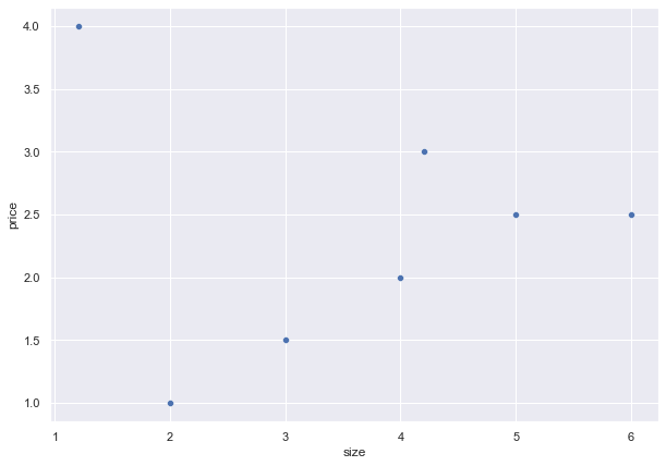
We can quickly see that there is a trend showing that the price increases as the size increases. However, it is also easy to notice the outlier where the price is 4 and the size is 1.
Creating a Scatterplot with Real Data
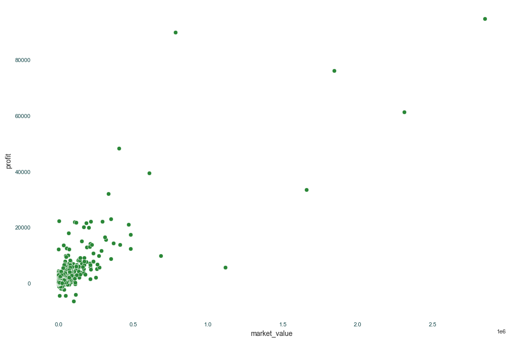
Now that we looked at a basic scatterplot, let's look at an example using actual data with a nicer graph that's closer to being "done."
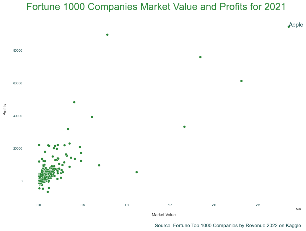
First, the data is the "Fortune Top 1000 Companies by Revenue 2022" dataset on Kaggle. This data set lists the Fortune 1000 companies, and a few stats for the 2021 year, such as their market value and profits for 2021. Let's see if there are any interesting findings when we compare market values with a company's profits. I downloaded the data set and cleaned up some of the data already.
We again set up our imports read in from the CSV I created when preparing the data.
import pandas as pd
import matplotlib.pyplot as plt
import seaborn as sns

df = pd.read_csv('fortune-1000-2022-prepared.csv')
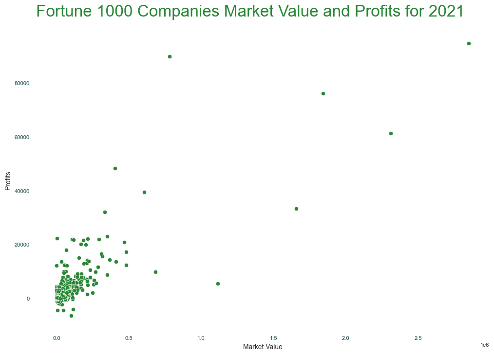
Setting Up Our Styles
Now, we can set up some styling options to apply to all of our Seaborn charts. We can do this using Seaborn's set_theme method. We can pass the method one of Seaborn's built-in styles to get started like this:
sns.set_theme('white')
While that gets us started, I usually make several additional tweaks to this. I tend to use Matplotlib's rcParams system. This sets the default values for all charts you'll create after you set them. This looks like this:
primary_color = '#2A8737'
secondary_color = '#104547'
tick_size = 8
rc_params = {
    "axes.spines.right": False,
    "axes.spines.top": False,
    "axes.spines.bottom": False,
    "axes.spines.left": False,
    "axes.titlecolor": primary_color,
    "axes.titlesize": 24,
    "axes.titlelocation": "left",
    "axes.titlepad": 20,
    "axes.labelsize": 10,
    "axes.labelpad": 15,
    "figure.figsize":(12, 8),
    "xtick.labelcolor": secondary_color,
    "xtick.labelsize": tick_size,
    "ytick.labelcolor": secondary_color,
    "ytick.labelsize": tick_size,
    "yaxis.labellocation": "center",
    "text.color": secondary_color,
    "font.size": 14
}
sns.set_theme(style="white", rc=rc_params)
I encourage you to review both Seaborn's aesthetics guide and Matplotlib's rcParams guide and tweak the values until you find some styling that you like.
Creating Our Chart
Now that we have applied our styles, we can start building our final graph. Seaborn makes these easy by having a scatterplot method. We can pass our data set to the method and define which data point goes along which axis.
We could have the color and/or style of each point be different based on the data but, for this, I had the color match the rest of the styling we will use. You could also use the size parameters to turn this into a bubble chart and have different sizes based on a 3rd dimension if you wanted to.
ax = sns.scatterplot(data=df, x='market_value', y='profit', color='#2A8737', legend=False)
Next, we can add our title and labels for the chart.
ax.set_title('Fortune 500 Companies Market Value and Profits for 2021')
ax.set_xlabel('Market Value')
ax.set_ylabel('Profits')
It is also normally best practice to add some text telling the viewer the source of the data. This is helpful in case they want to dig deeper into the data. Additionally, it helps inform them how old the data is. This is useful in various settings, even if you only share charts within internal tools, such as Slack.
We could pass x and y values that are based on the data set (the default), but I like setting the transform to match the axis size as it tends to be easier for me to find the correct values for where I am putting the text.
ax.text(1, -.15, 'Source: Fortune Top 1000 Companies by Revenue 2022 on Kaggle', fontsize=12, horizontalalignment='right', transform=ax.transAxes)
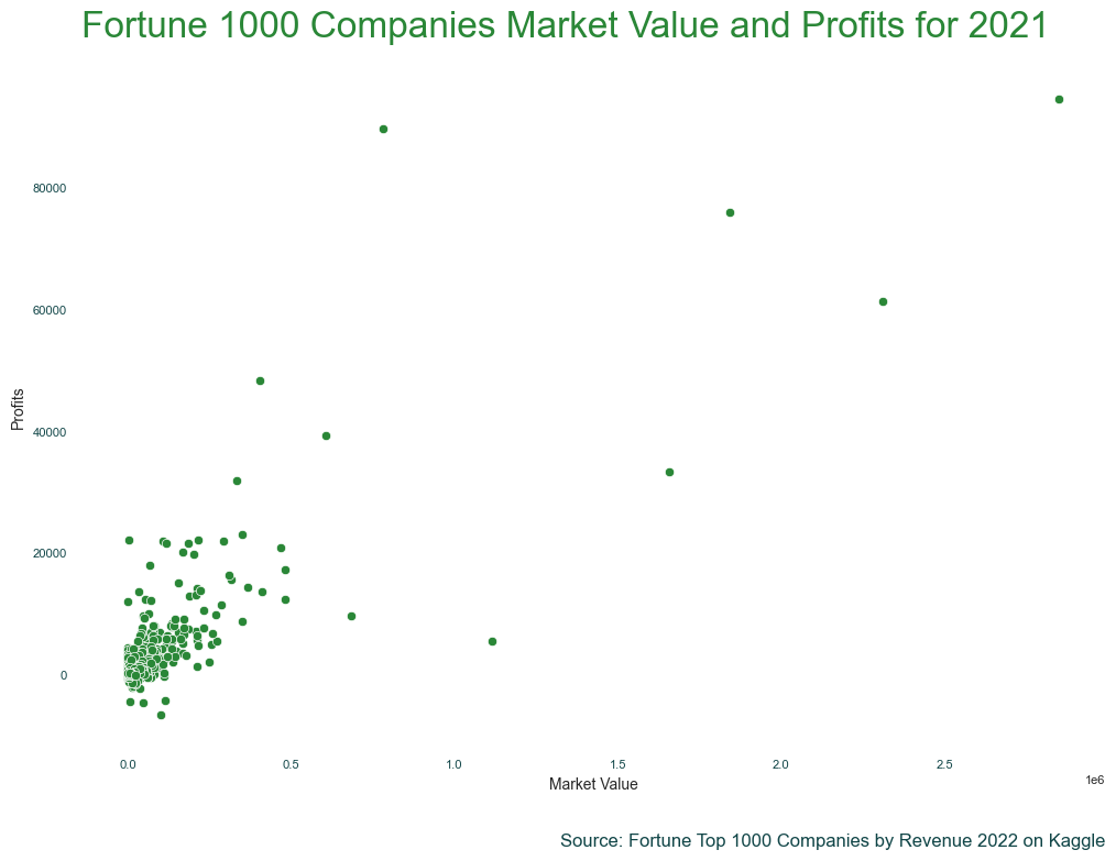
Our chart is starting to look good. But, there are some interesting data points in the graph. Adding an annotation or two with some additional details might be helpful. We can do this using the annotate method.
ax.annotate(text='Apple', xy=(2849537,94680))
Having some text on top of the point is okay, but we can make this a little nicer by moving the text away from the point and using an arrow.
arrow_props = {
    "width": 3,
    "headwidth": 8,
    "color": secondary_color
}
ax.annotate(text='Apple', xy=(2830000,94680), ha='center', xytext=(-50, -5), textcoords='offset points', arrowprops=arrow_props)
ax.annotate(text='Berkshire \n Hathaway', xy=(798942,89795), ha='center', xytext=(70, -10), textcoords='offset points', arrowprops=arrow_props)
ax.annotate(text='Tesla', xy=(1133707,5519), ha='center', xytext=(50, -5), textcoords='offset points', arrowprops=arrow_props)
ax.annotate(text='JPMorgan \n Chase', xy=(425526,48334), ha='center', xytext=(70, -10), textcoords='offset points', arrowprops=arrow_props)
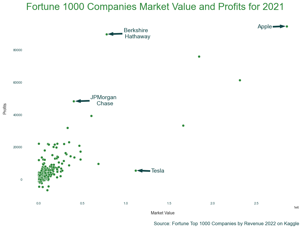
Of course, what you annotate and how you label and title your chart will depend on the story you are telling. If you are more focused on the scenario where most of the Fortune 1000 companies, while all big companies, are dwarfed by the top companies, we would probably handle this chart differently.
Next Steps
Great! We now have a basic chart that shows the relationship we wanted to visualize. If we are just reviewing this or sharing it with a few team members, we probably have already done more work than we needed. But, if you are planning on sharing this with a broader group or publicly, there are a few more things you could consider:
- The market value labels are not intuitive for all audiences. You can try replacing those with something like just "1 Trillion", "2 Trillion", and "3 Trillion".
- Some of the spacing could be tweaked to be nicer. You can test out different values for our title and label padding as well as adjusting the arrow size for our annotations.
- The font sizes we currently have probably could be tweaked a bit more to create a better visual difference between the different text.