Creating Your First Chart Using Seaborn
When working with data in Python, there are many times when you will need to analyze or visualize the data. For example, maybe you are quickly looking for outliers or are creating a few charts to be shared.
There are many libraries for creating graphs. The most common is matplotlib. However, that can be a lot lower level than you need most of the time and has a steep learning curve.
This is where seaborn comes in. Seaborn is a library built on top of matplotlib and makes creating charts from data sets simple.
Seaborn Basics
Seaborn is tightly integrated with Pandas, so you can pass almost any data frame as the data set. Additionally, you can use a variety of other data structures too. Let’s take a look at the minimum steps for using Seaborn.
When creating a chart with Seaborn, there are only a few required steps as shown in the code below.
# Import Seaborn, usually aliased as sns.
import seaborn as sns
# Create a sample dictionary of x,y values.
data = {
'a': 1,
'b': 2,
'c': 3,
'd': 4
}
# Create a basic line chart.
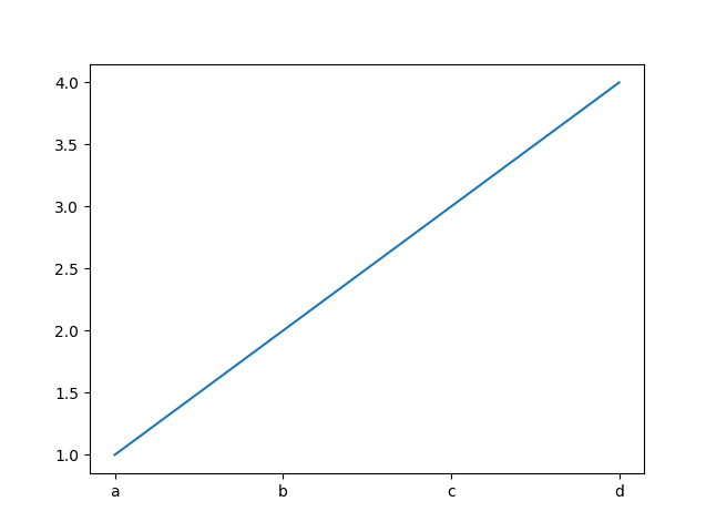
sns.lineplot(data=data)
This will create a line chart using all the default options assuming the dictionary pairs are x, y values, as shown in the screenshot below.
Seaborn includes a variety of methods for built-in chart types, including lineplot, countplot, relplot, and boxplot. You can view all of the available methods in the Seaborn API reference.
Creating a Line Chart Using Pandas Dataframes
In many cases, you will start with a Pandas data frame with multiple columns. In this case, it will work almost the same, except we can pass the x and y names.
Let’s start with a basic dataframe that contains a few rows for the total revenue a store earned per day. We can then pass that dataframe to seaborn as we did before, but this time, we will specify the x and y axes.
# Import Pandas and Seaborn
import pandas as pd
import seaborn as sns

# Create our dataframe.
df = pd.read_csv('example-df.csv')

# Create a basic line chart.
sns.lineplot(data=df, x='date', y='total_revenue')
Improving Your Chart
While the default graphs might work for just quickly visualizing a data set, you will often need to share these charts. With Seaborn, you have many ways to alter a chart, such as using a Seaborn helper method or using a matplotlib function on the return chart instance.
Adding Labels
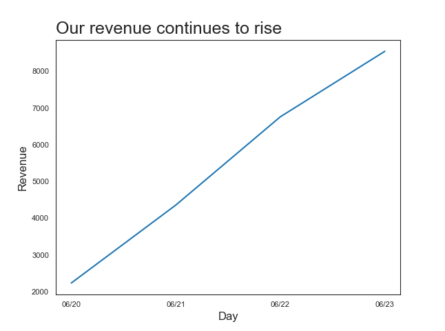
First, let’s add the title. To do this, we can chain the set method directly on the chart call.
sns.lineplot(data=df, x='date', y='total_revenue').set(title='Our revenue continues to rise')
We can also use this to set the axis labels by setting the xlabel and ylabel values.
sns.lineplot(data=df, x='date', y='total_revenue').set(title='Our revenue continues to rise', xlabel='', ylabel='')
This works well if we are just adding some text to the chart. But, what if we want to adjust size or positioning? We could use global Seaborn values, such as font scale, to alter all font sizes.
sns.set(font_scale=2)
However, you will often need to adjust specific labels or titles. To do this, we can access the underlying matplotlib values as shown in this code:
# Import matplotlib so we can use the plot methods.
import matplotlib.pyplot as plt

# Add title and axis labels
plt.title('Our revenue continues to rise', fontsize=18)
plt.xlabel('Day', fontsize=12)
plt.ylabel('Revenue', fontsize=12)
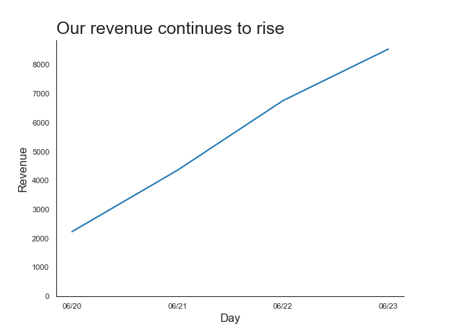
Once we start using the matplotlib methods, we have a little more control over our text as well. For example, for the title, it might be better to left-align it which, we can do by using the loc parameter:
plt.title('Our revenue continues to rise', fontsize=18, loc='left')
If we need to, we can also adjust the font size of the tick labels (the labels along each axis) using a similar method:
plt.tick_params(axis='both', labelsize=8)
This gets our graph to look like this:
Adjusting Styles
Now that we have some labels in place, we should start adjusting the graph itself. The first thing we may want to do is adjust our starting values along one or both axes. We can do this by calling matplotlib's ylim method. If we needed to, there is also a xlim method.
# Set the y axis to start at 0.
plt.ylim(bottom=0)
Seaborn also comes with a variety of default themes and styles as well as methods to help us control different aspects of the graph. You can start with setting the set_style method to one of five themes: darkgrid, whitegrid, dark, white, and ticks.
I normally start with white which we can set with this code before we start creating our charts:
sns.set_style('white')
From there, I sometimes remove the border not along the labeled axes. Seaborn has a method that takes care of this for us:
sns.despine()
The despine method can also accept values for specific sides and offsets. I usually start with the defaults and then fine-tune, if needed.
So, if we use these with our graph, our code looks like this:
import matplotlib.pyplot as plt
import pandas as pd
import seaborn as sns

# Create our dataframe.
df = pd.read_csv('example-df.csv')

# Set the default theme.
sns.set_style('white')

# Create our chart.
sns.lineplot(data=df, x='date', y='total_revenue')

# Add our text.
plt.title('Our revenue continues to rise', fontsize=18, loc='left')
plt.xlabel('Day', fontsize=12)
plt.ylabel('Revenue', fontsize=12)
plt.tick_params(axis='both', labelsize=8)

# Set the y axis to start at 0.
plt.ylim(bottom=0)

# Remove extra borders.
sns.despine()
This results in a graph like the following image.
While there is a lot more we could do with this graph using Seaborn's functionality, this is already a chart that can be used in your analysis or sharing with colleagues. Great job learning the basics of Seaborn!
Next Steps
Now that you know how to create a basic graph using Seaborn, go ahead and try to create a few charts. From there, you will want to try adjusting the styling more as well as creating other chart types. Here are a few ideas to get you started:
- Try to change the color of the title to a color that matches a brand you like.
- Try to change the color and width of the line.
- Try creating a bar graph using Seaborn.
Similar Articles
Creating A Heatmap Chart In Seaborn
Heatmaps are a great way to visualize the frequency or ranges of a multi-dimensional dataset. Learn how to create them in Python using Seaborn.
Creating A Scatterplot Chart In Seaborn
Scatterplots are a great way to visualize relationships between different dimensions. Learn how to create them in Python using Seaborn.