Creating A Heatmap Chart In Seaborn
Heatmaps are a great way to visualize the frequency or ranges of a multi-dimensional dataset. For example, you could quickly show which features users use the most on different paid plans of a SAAS app. You could also show which fields of a GraphQL API are used the most between different customer personas. Or, you can compare different months in different years for a specific event, such as the number of sales or the amount of rainfall.
This is useful if you are looking for trends or outliers in your data set. This could be in your early analysis to see what you want to look deeper into or when sharing findings with stakeholders or a broader audience.
In Python, we can use the Seaborn library to quickly generate heatmaps. If you are new to Seaborn, you can glance through my "Creating Your First Chart Using Seaborn" article to get a quick sense of how Seaborn works.
Creating Our First Heatmap
First, let's set up our imports and load our data. For this first graph, we'll use fake data showing how many users are using a specific feature on specific plans. I have used a similar chart in the past to show which features are used the most (or the least) on different plans.
import pandas as pd
import seaborn as sns

fake_data = [{
    'index': 'Starter Plan',
    'Feature A': 96,
    'Feature B': 43,
    'Feature C': 16
},{
    'index': 'Growth Plan',
    'Feature A': 93,
    'Feature B': 58,
    'Feature C': 76
}, {
    'index': 'Business Plan',
    'Feature A': 98,
    'Feature B': 87,
    'Feature C': 45
}]
fake_df = pd.DataFrame.from_records(fake_data, index='index')
Seaborn has many different methods for creating charts. For heatmaps, we can use the heatmap method. This method accepts a dataset along with what should be along each axis.
For our fake dataset, our code will look like this:
sns.heatmap(data=fake_df)
This creates a very basic heatmap like this:
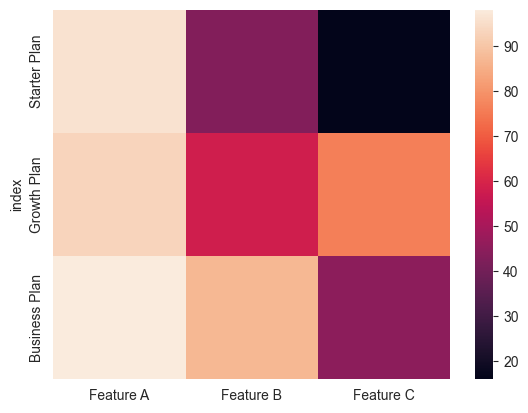
We can quickly see that feature A is used across all plans; however, feature B is used much more on the "Business" plan and feature C is rarely used on the "Starter" plan. Of course, this is fake data with only 3 features, so it would be easy to see this in a table. However, if you had a large dataset with many features, this would be a quick way to see which features are used the most or the least.
Creating a Heatmap with Real Data
Now that we looked at a basic heatmap, let's look at an example using actual data with a nicer graph that's closer to being "done."
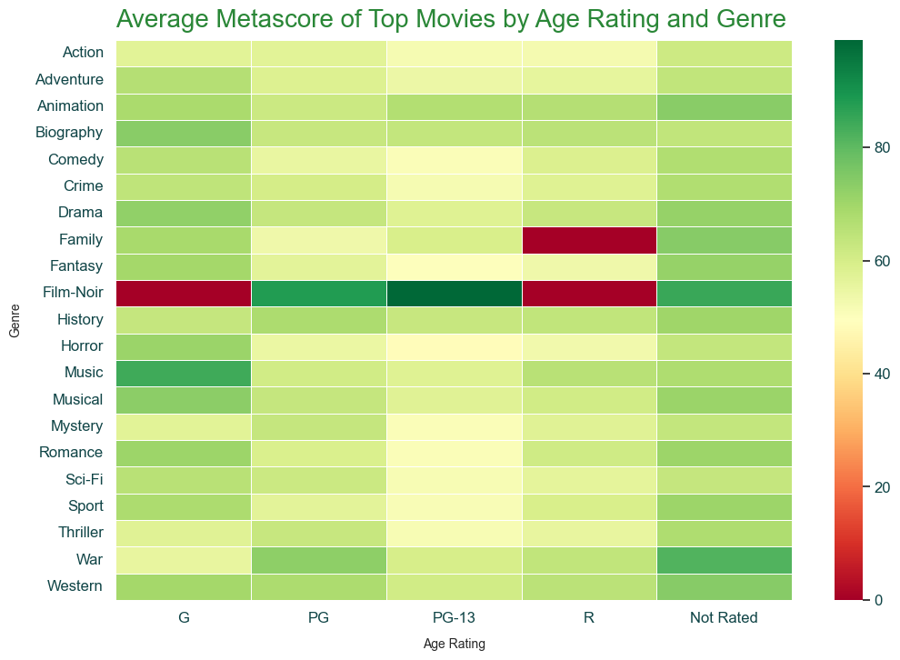
First, the data is "IMDB Top 10,000 movies (Updated August 2023)" on Kaggle. This data set provides us with the top movies, their metascores, and other metadata about the movie. Let's see if there are any interesting findings when we examine metascores based on genre and age-rating. I downloaded the data set and cleaned up some of the data already.
A caveat about this data set: Since it's the top 10k movies, we would expect the metascore to be skewed towards the high end. So, the heatmap might end up not having any lower values displayed. However, that may make it easier to spot outliers or interesting trends on the lower side.
We again set up our imports read in from the CSV I created when preparing the data.
import pandas as pd
import seaborn as sns

df = pd.read_csv('IMDB-top-10000-movies.csv')
Setting Up Our Styles
Now, we can set up some styling options to apply to all of our Seaborn charts. We can do this using Seaborn's set_theme method. We can pass the method one of Seaborn's built-in styles to get started like this:
sns.set_theme('white')
While that gets us started, I usually make several additional tweaks to this. I tend to use Matplotlib's rcParams system. This sets the default values for all charts you'll create after you set them. This looks like this:
primary_color = '#2A8737'
secondary_color = '#104547'
tick_size = 12
rc_params = {
    "axes.spines.right": False,
    "axes.spines.top": False,
    "axes.spines.bottom": False,
    "axes.spines.left": False,
    "axes.titlecolor": primary_color,
    "axes.titlesize": 20,
    "axes.titlelocation": "left",
    "axes.titlepad": 10,
    "axes.labelsize": 10,
    "axes.labelpad": 10,
    "figure.figsize":(12, 8),
    "xtick.labelcolor": secondary_color,
    "xtick.labelsize": tick_size,
    "ytick.labelcolor": secondary_color,
    "ytick.labelsize": tick_size,
    "yaxis.labellocation": "center",
    "text.color": secondary_color,
    "font.size": 14
}
sns.set_theme(style="white", rc=rc_params)
I encourage you to review both Seaborn's aesthetics guide and Matplotlib's rcParams guide and tweak the values until you find some styling that you like.
Creating Our Chart
Now that we have applied our styles, we can start building our final graph. Seaborn makes these easy by having a heatmap method. We can pass our data set to the method and it will handle most of the rest.
The main area you may want to tweak is the color scheme. You can do that by setting the cmap parameter to be any of the default Matplotlib colormap values or passing your own. For this, I'll use cmap='RdYlGn' which will make the lower values (if any) red and the higher values green while making the middle values yellow.
You can also use the linewidths=0.5 parameter to put a little spacing between each cell. This usually makes it a little easier to read the chart but you will want to adjust it based on the design you are looking for.
ax = sns.heatmap(data=df, linewidths=0.5, cmap='RdYlGn')
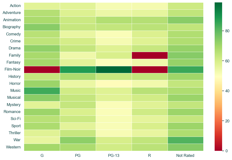
At quick glance, we notice a few things that might warrant investigation or sharing:
- There are three cells that have 0 metascore. A quick look shows that in our data set, there are no movies that fall into those age rating and genre combinations. If this was a real data set, we may want to investigate our pipelines or sources to ensure we are not missing data.
- Film-Noir seems to have a much higher average in the metascores. A quick look shows that in both PG and PG-13, our data set only has 1 Film-Noir movie each. If this was a real data set, we may want to investigate if there is a reason for this or if it is just a coincidence. Additionally, we'd decide if we want to include Film-Noir in our analysis (and make a note in accompanying material if we are sharing) or if we want to exclude it.
- PG-13 tends to have a lot lower average of metascores across many genres.
- Other than Film-Noir, the two combinations that tend to have the highest metascores are G-rated Music movies and Not-rated War movies.
Now that we've looked at the chart and data, we can add our title and labels for the chart.
ax.set_title('Average Metascore of Top Movies by Age Rating and Genre')
ax.set_xlabel('Age Rating')
ax.set_ylabel('Genre')
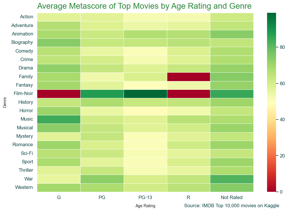
It is also normally best practice to add some text telling the viewer the source of the data. This is helpful in case they want to dig deeper into the data. Additionally, it helps inform them how old the data is. This is useful in various settings, even if you only share charts within internal tools, such as Slack.
We could pass x and y values that are based on the data set (the default), but I like setting the transform to match the axis size as it tends to be easier for me to find the correct values for where I am putting the text.
ax.text(1.12, -.086, 'Source: IMDB Top 10,000 movies on Kaggle', fontsize=12, horizontalalignment='right', transform=ax.transAxes)
Visualizing Missing Data with Heatmaps
A trick I like to use heatmaps for is to quickly identify any patterns in missing data.
Let's create some fake data where certain columns tend to have missing values:
fake_null_data = [{letter: None if i % 2 == 0 and letter in ['F', 'G'] else 15 for letter in ['A', 'B', 'C', 'D', 'E', 'F', 'G']} for i in range(10)]
fake_null_df = pd.DataFrame.from_records(fake_null_data)
Now, we can create a heatmap of whether or not the cell is null. This will allow us to quickly see if there are certain columns that have a lot of missing values. This can happen if a data pipeline is broken or one of your data providers may not be syncing correctly.
The cbar is just to remove the color bar on the right side of the chart as that is not needed here. I like to use the inferno colormap here as it makes the null cells stand out since they are bright colors while the rest are black.
sns.heatmap(fake_null_df.isnull(), cbar=False, cmap="inferno")
This gives us a heatmap that looks like this:
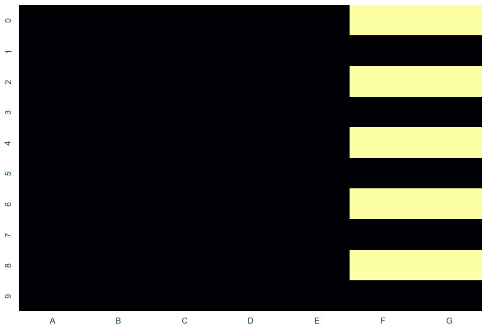
Using a chart like this, we can quickly spot that columns F and G tend to have a lot of null values and always at the same time which suggests it might be an upstream issue.
Next Steps
Great! We now have a basic chart that shows the analysis we wanted to visualize. If we are just reviewing this or sharing it with a few team members, we probably have already done more work than we needed. But, if you are planning on sharing this with a broader group or publicly, there are a few more things you could consider:
- The data ended up being skewed towards the higher end of the metascore. We could see if we could find a source that includes more movies or we could replace the 3 cells with 0 metascore to allow us to show a more granular range.
- We may want to handle the Film-Noir differently or omit it.
- Some of the spacing could be tweaked to be nicer. You can test out different values for our title and label padding as well as adjusting the arrow size for our annotations.
- The font sizes we currently have probably could be tweaked a bit more to create a better visual difference between the different text.
Similar Articles
Creating A Scatterplot Chart In Seaborn
Scatterplots are a great way to visualize relationships between different dimensions. Learn how to create them in Python using Seaborn.